A Little Ghee Goes a Long Way
In 2021, Milky Mist, a local brand gone global brand approached us with a brief
to create a new design for their ghee packaging. The goal was simple,
the world was waking up to a post covid era and in a barrage of things
that were marketed as healthy and immunity booster, they need
something they could trust!
The Churning Process
For the ideation, we first conducted research on the perception of
ghee in our country and what prompts a customer to buy one brand over the other. We also went super local and deep dived to reach to the observation that people in the south preferred vibrant colours but
yet liked the look to be polished. And the “gold effect” was real!
So, we got down to work
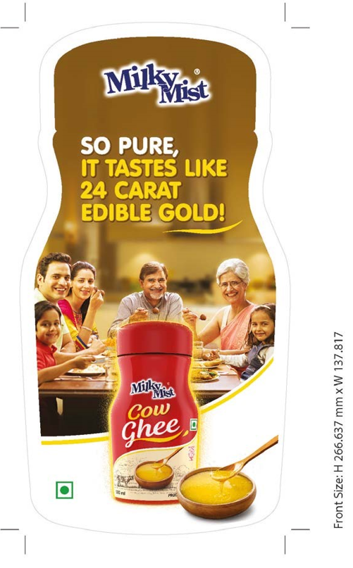
The Packaging Pantone Card

The Final Reveal
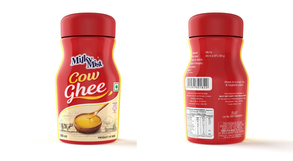
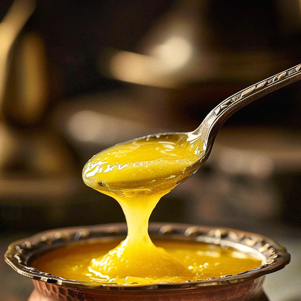
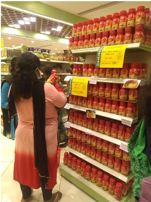
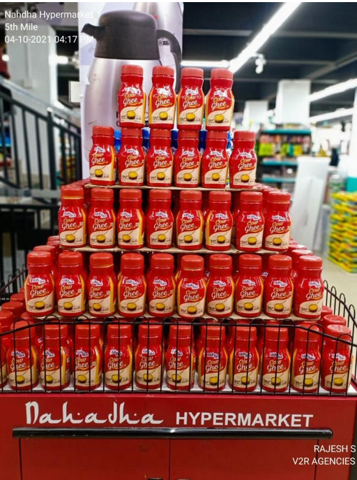
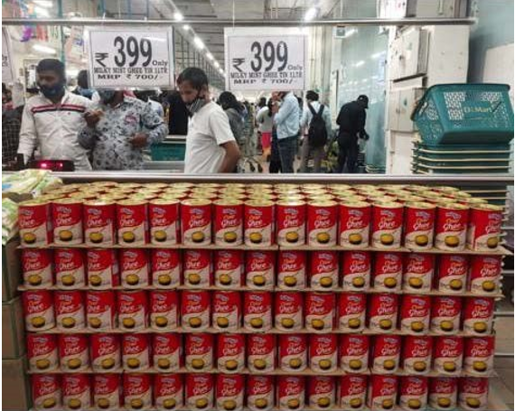
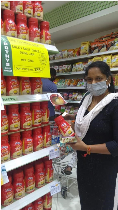
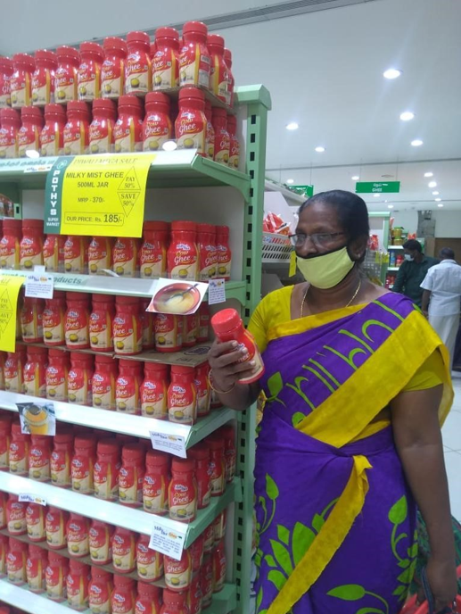
The packaging was done in a way that it stood out on the shelf with its bold red and the simple bowl of ghee on the front spoke clearly about its quality and purity. It is said that the purest cow ghee should be a bit golden yellowish in colour
to stand its test
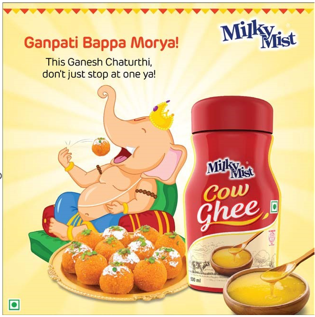
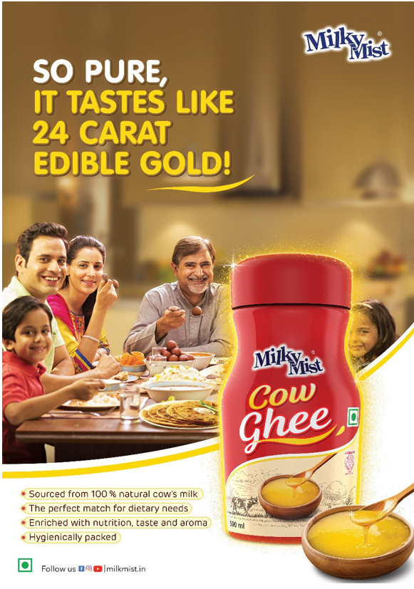
A Glimpse at Marketing of Milky Mist
IRL IMPACT
What Did the Data Say
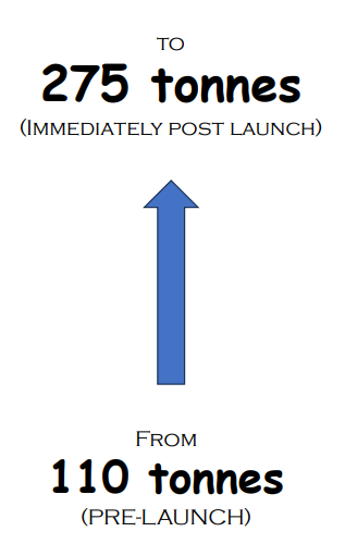
The Sales Increased From 110 tonnes to 275 tonnes immediately after post launch
Today's Scenario
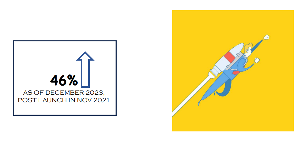
The sales are 46% high as compared to Post Launch in Nov 2021.

